Tuesday 15 August
This is my first ever post on a blog - thanks to you Janice!
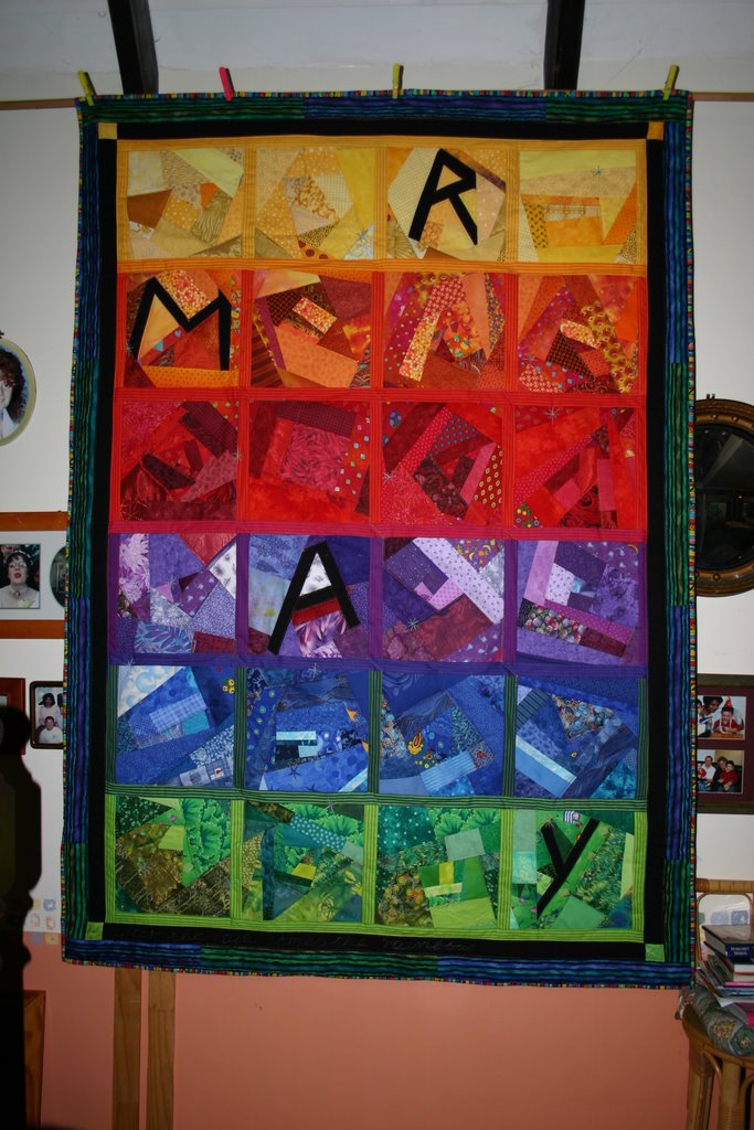
On the morning of Sunday Aug 6 I woke up with the plan for a quilt in my head. The night before I had been looking at the blog of Tonya Ricucci (Lazy Gal Quilting) where she has posted lessons on how to make free-cut patchwork letters. I thought this was fun and got to thinking about what I would like to say on a quilt. The next morning it was there. The whole concept, the text and even the title"After the Party". I don't think I have ever thought about a plan for a quilt in such 'completeness', if that is the term, before. Nor have I planned anything so original (or so personal). Usually I just make a few blocks and play around to see what looks nice and go from there.
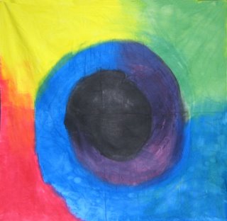
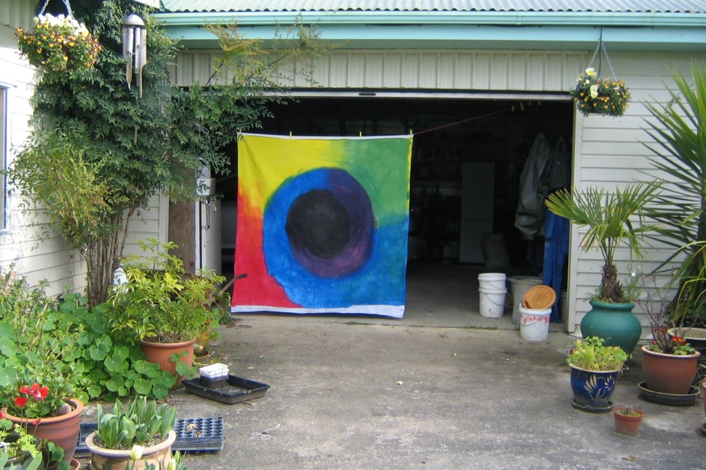
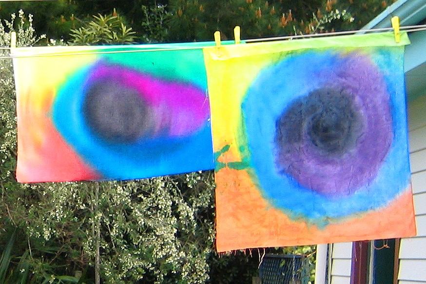
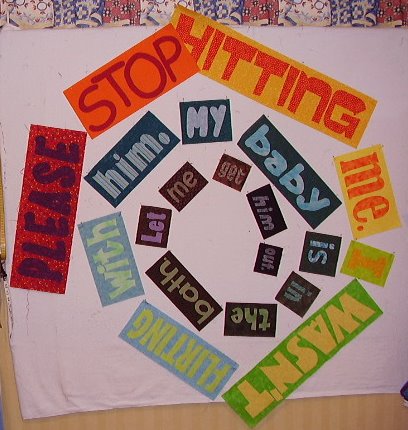
The story I wanted to tell was about my experience with domestic violence. Specifically the one incident that made me realise I had to leave my partner to keep my son and myself safe. It has been nearly 15 years since I left, so this story has been a long time in telling. I want to portray the idea of being bright on the outside but dark on the inside, the feeling of being little and vulnerable inside a big bright exterior, and of being sucked into a black pit. The title refers to the fact that this incident occurred after we had returned from a social occasion.
I checked the challenge requirements for Symposium 2007 and realised that I needed to have a 'collaborator' to make this quilt. I thought I would ask Janice if she was interested in helping me but I expected her to say no 'cos I know how much work she has on. Also the topic is not one everyone can deal with.
I showed Janice my plans and my first pieced word and after telling her she didn't have to say yes, she agreed to work with me. "Wahoo" I think is the celebratory word used online.
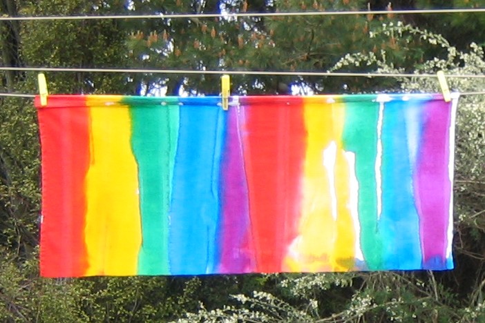
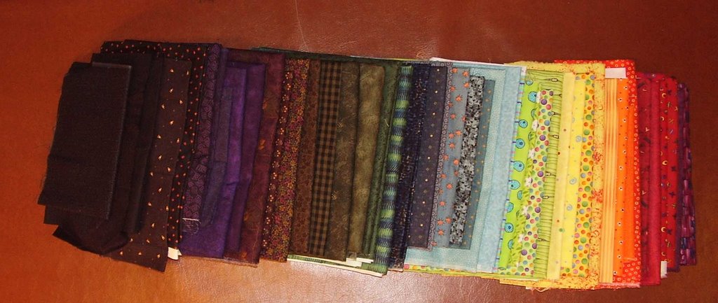
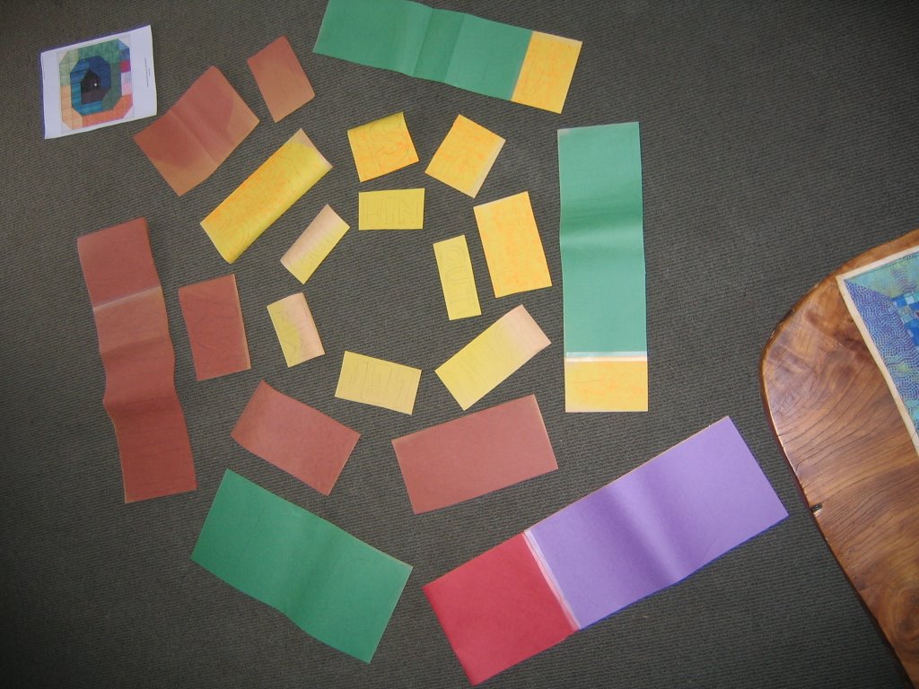
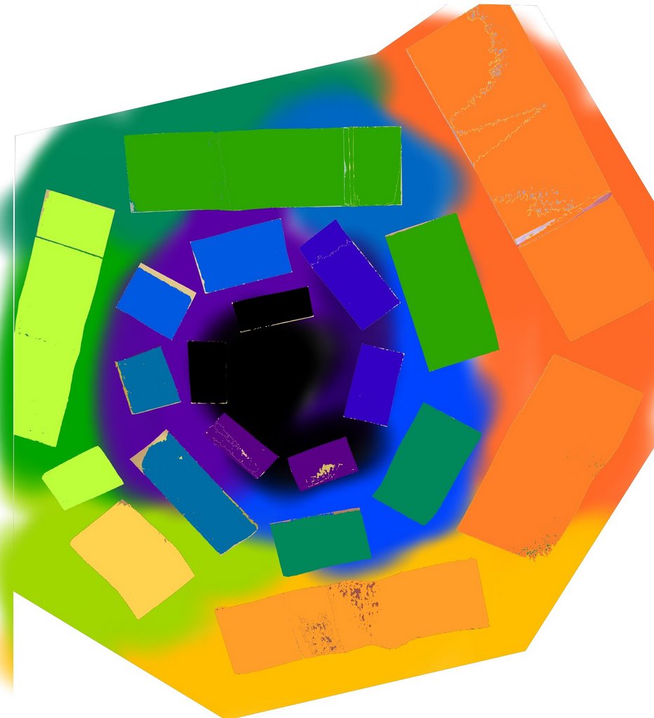
I am now at the stage of having done a couple of words and deciding that we might have the scale too big. I have reduced the size of the words to be traced but now I think I need to make some fabric choices before I do any more words. I need to get the colour transition right.